


How to choose child-friendly fonts and layouts for personalised school bags
Have you ever peered into a crowded school cloakroom, trying to spot your child’s bag? Faded lettering, decorative script, and low-contrast prints can make names hard to read from a distance. The result is a slower morning routine and a greater chance of bags being picked up by mistake.
This post shows how to choose clear, hard-wearing fonts, match font style and size to your child's age and reading ability, and place text with high contrast for immediate visibility. These practical choices keep names legible through wear and weather, speed up drop-off routines, and make it easier for children to find their own belongings independently.

Choose clear, hard-wearing fonts to ensure long-term legibility
Choose letter shapes with open counters and clear, distinct forms. Round, simple sans-serif characters make it easier to tell O, 0, l, and 1 apart at a glance. Print a sample name, stand back to a typical classroom distance, and ask someone who wasn’t involved to read it aloud to check legibility. Use a medium to bold weight and avoid hairline strokes. Thin strokes tend to abrade, break up, or fade during production and after washing, which reduces legibility on keepsakes and garments. As a final check, make a production-style sample and rub or launder it to see which strokes disappear first. Real-world testing like this quickly shows which letterforms and weights will hold up over time.
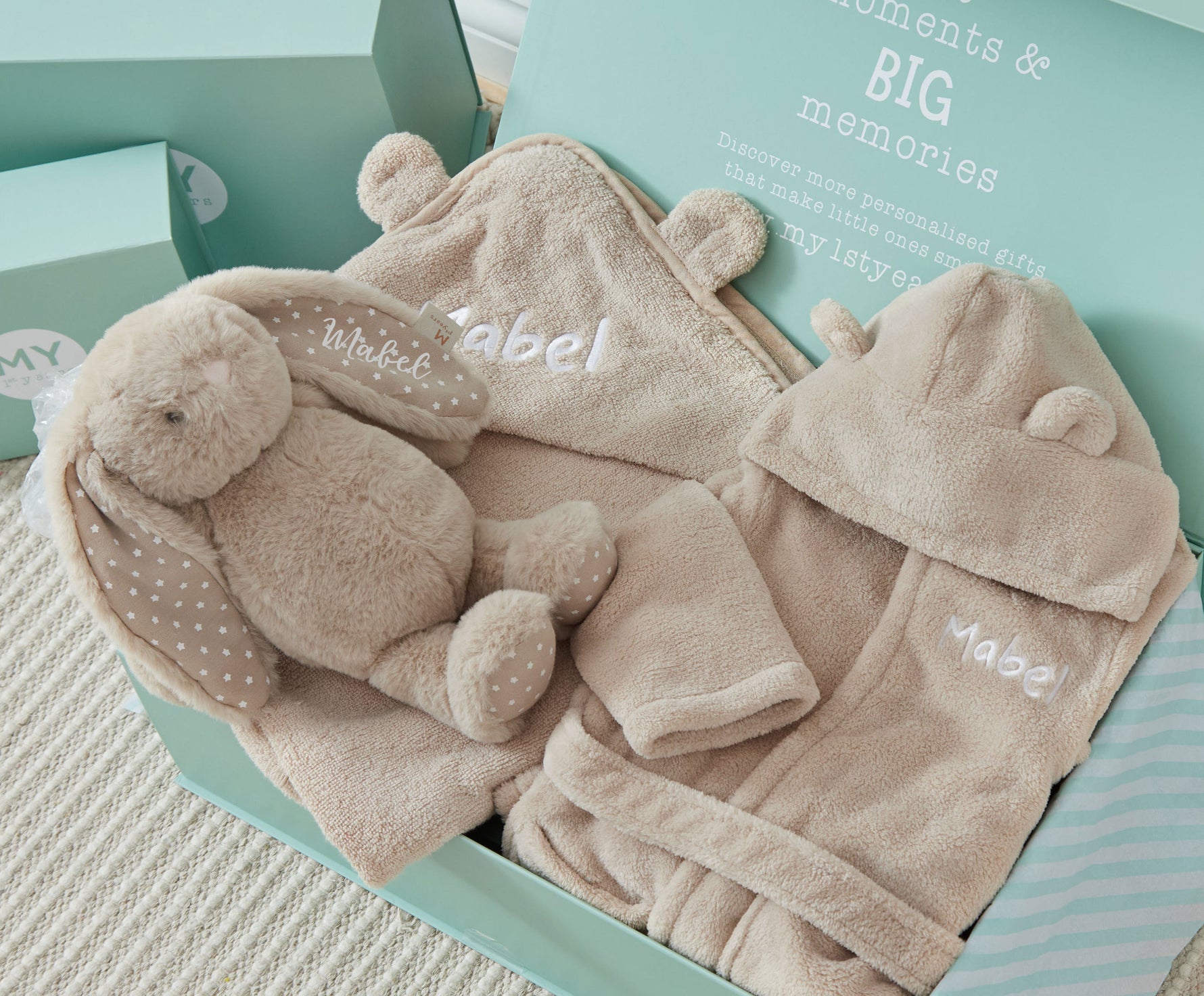
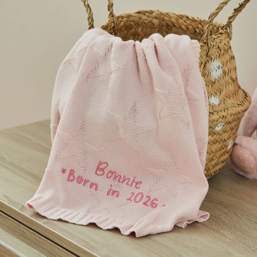
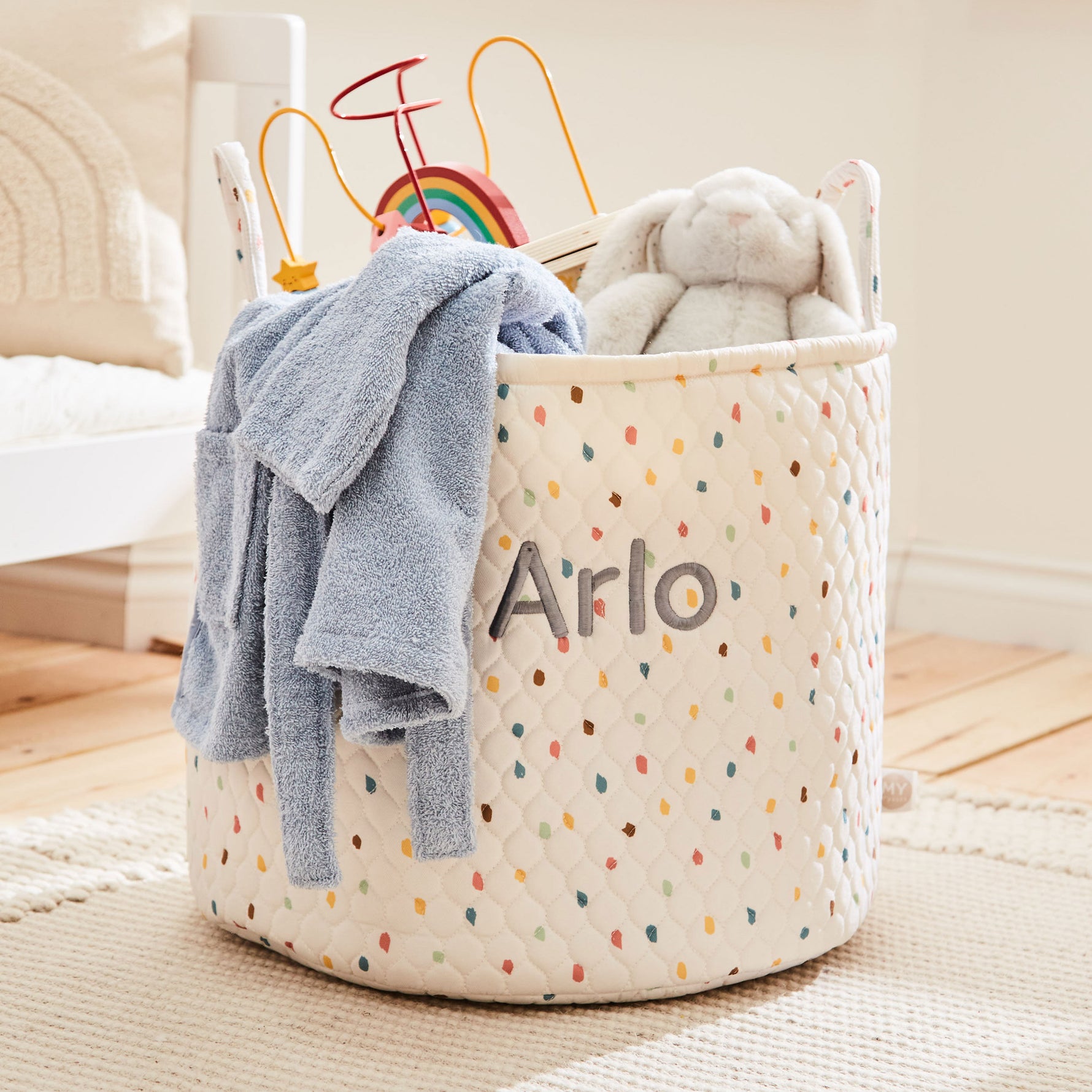
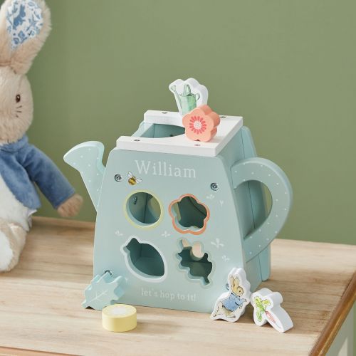
When adding text to a keepsake, small choices make a big difference to how easily it reads over time. Follow these practical tips to keep your lettering clear and long lasting. Use mixed case and sensible letter spacing. Mixed case preserves word shape and helps the eye recognise words faster than all capitals. When in doubt, compare capitalised and all-caps versions at arm’s length to see which reads more quickly. Match the font to the production method. Embroidery favours blocky, single-stroke letterforms at larger sizes, because stitching loses fine detail. High-resolution printing can retain finer details, so you can use more delicate typefaces. Before finalising a design, request or make samples using the intended process so you can judge how the type actually reproduces. Maximise contrast and avoid busy backgrounds. Place text away from seams, folds, and patterned panels, because background noise and low contrast reduce legibility. A clear, uncluttered backdrop lets even small lettering remain readable. Test for real-world conditions. Check visibility under bright and low light, and after a simulated wear cycle such as washing or repeated handling, to ensure the chosen font, weight, and placement stay readable over time. These steps help you choose lettering that not only looks lovely at first glance, but stays readable as a treasured keepsake.
On this notepad, use medium-bold, open-counter letters, mixed-case.


Match font style and size to your child's age and reading level
When personalising a child’s bag, choose a clean, humanist sans-serif or a rounded grotesque. Simple letterforms with open counters and low stroke contrast help early readers recognise letters more quickly. Avoid script, ornate, or tightly kerned display faces, which can make characters blend together. Test fonts by printing individual problem letters such as a, e, g, and r to check clarity. Size matters too, so make samples at several sizes and view them from the distance the child will normally see the bag, or ask the child to read the samples rather than relying solely on point sizes.
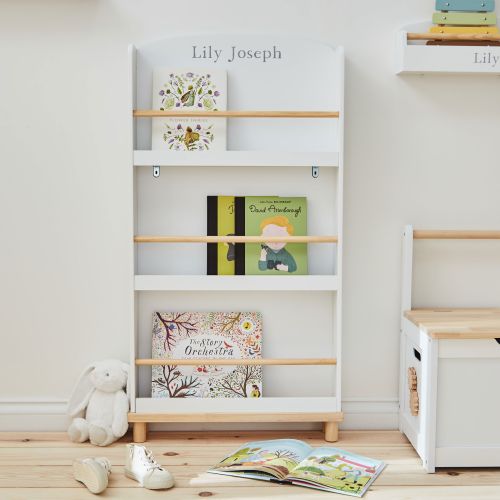
Use mixed case for names to preserve familiar word silhouettes, which helps children recognise whole words more quickly. Slightly widen the letter spacing to reduce crowding for young children who are learning to read, and keep the name on a single line where possible so the word shape stays intact. Maximise foreground–background contrast by placing the name on a plain panel or a single colour, and choose a matte finish to cut glare that can obscure letters in motion or in low light. Validate your design by photographing the personalised area from typical viewing angles and with the bag in use, then ask the child or their peers to find and read the name. For children not yet reading, pair the name with a clear icon or colour block, record any confusion, and iterate the design accordingly.
Use mixed case and widened spacing on the initial panel.


Place text on high-contrast colour backgrounds for immediate visibility
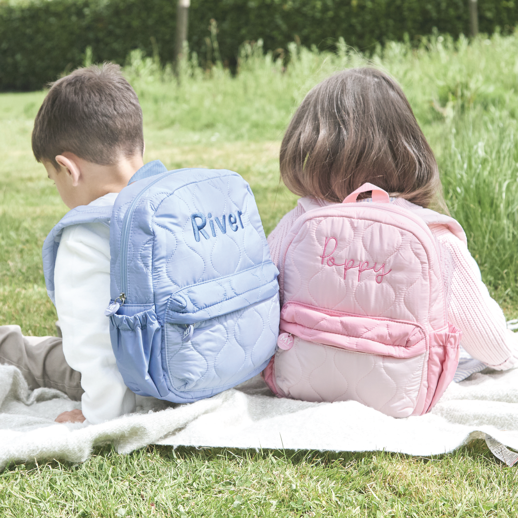
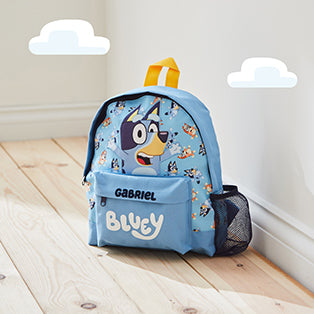
Place personalised text on a flat, unobstructed area of the bag, such as the front pocket, top flap, or side panel. Avoid seams, zips, and curved edges, which can cause letters to warp. Prototype on the actual bag and view it at arm's length in typical use to confirm legibility. Keep identification distinct from decoration by giving names generous margins and aligning text with the natural reading flow. For school systems, add a discreet labelled patch inside the bag, reserving the external area for immediate visibility.
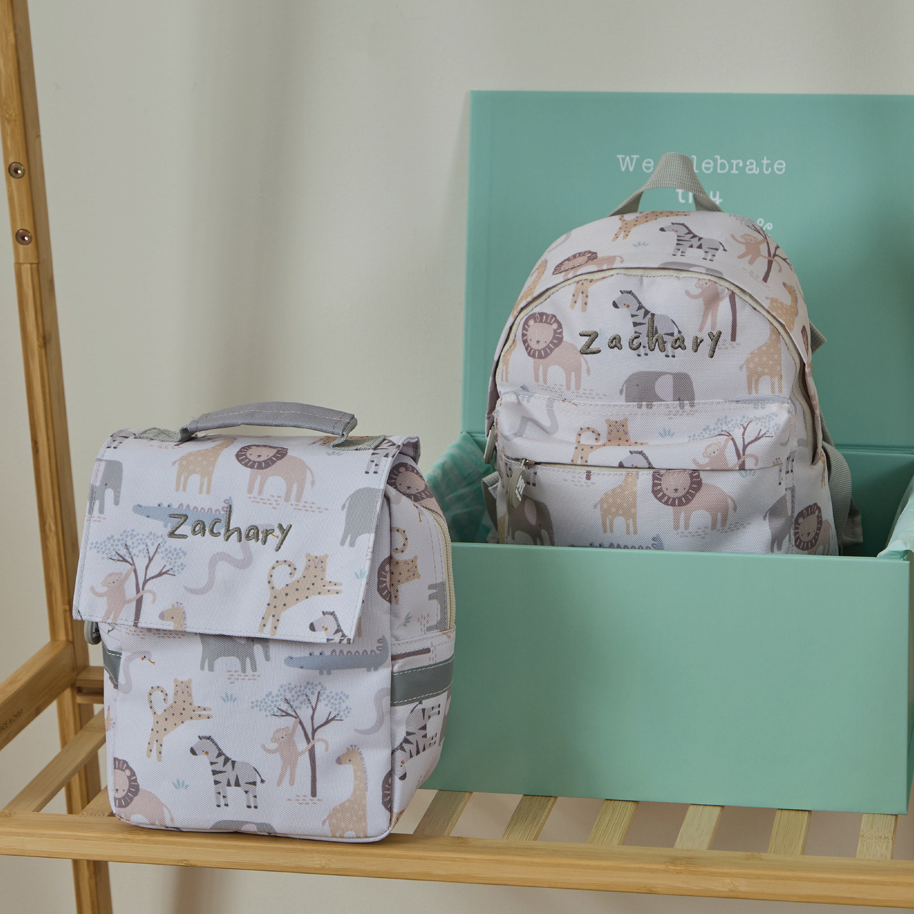
Subtle adjustments affect how a personalised name reads on a bag. Prioritise luminance contrast over colour names: place dark text on light panels, or light text on dark panels. When a pattern is busy, add a solid stroke or a backing panel so children and colour-blind readers can still read the name easily. Choose larger, simple type, increase the font size, and use generous tracking and comfortable line height. Favour sentence case or initial capitals rather than all caps to speed word recognition. Always test designs on the actual material. Matte finishes tend to reduce glare, glossy surfaces can wash out colour, and textured fabrics may break up letter strokes. Check prototypes from different angles, and in varied lighting before you finalise the design to evaluate how the personalised name performs in everyday use.
Place clear, durable lettering in a high-contrast position so personalised names stay readable at arm's length, even after laundering and everyday wear. Create production-style samples, photograph them from typical viewing angles, and ask others, including the child, to read the name, which confirms legibility before you finalise the design.
Apply the guidance on font family, weight, case, spacing, and placement, and prototype on the actual material rather than relying on point sizes alone. Materials and production methods change how a typeface looks and reads, so a printed or stitched sample reveals real-world legibility and spacing. These steps echo earlier advice on font choice, age-appropriate sizing, and consistent placement, and they provide practical, testable ways to reduce mix-ups and streamline handover processes.
Share


